Murals and Housing Values in Philadelphia
Pelle Tracey
Is there a relationship between the number of murals and home values in a neighborhood? This was the central question behind our 2022 LEADING Fellows research project, directed by Dr. Synatra Smith (Philadelphia Museum of Art) in collaboration with Dr. Alex Wermer-Colan at the Temple University Scholars Studio.
At first, it seemed straightforward: wealthier neighborhoods have more murals because residents can better advocate for beautification projects. But the relationship might work the other way – murals could contribute to rising home values, either directly through curb appeal or indirectly through gentrification. We set out to examine this in two ways: statistical analysis and interactive mapping.
Data Sources
We combined two datasets:
- Mural locations from the Philadelphia Mural Arts Program, including creation dates, postal codes, and decommission dates for murals no longer on view.
- Housing values from the Zillow Home Value Index (ZHVI), which provides smoothed monthly estimates of typical home values by zip code from 2000 to the present.
We chose ZHVI over the city’s property assessment data because it covers a longer timeframe (2000–2022 vs. 2015–2023) and doesn’t rely on sporadic assessment or sale events.
Data Wrangling
The housing data was relatively clean – filter to Philadelphia, pivot to long format, compute yearly averages by zip code using R’s dplyr and lubridate.
The mural data required more work. A subset of murals had been decommissioned, and the “on-view dates” column was messy – dates appeared in formats like YYYY-YYYY, mm/dd/yyyy-mm/dd/yyyy, and plain YYYY. Parsing these required regex extraction with stringr::str_extract, splitting into separate dataframes by format, converting to proper date types, and recombining. The Regexplain RStudio addin was a lifesaver here.
Once both datasets were clean, we joined them by zip code and year to produce a single dataframe tracking mural counts and housing values over time.
Interactive Map
We built an R Shiny app using Leaflet to visualize the data spatially. The app lets you select a year and toggle between two choropleth layers:
- Housing values by zip code (Reds palette)
- Mural counts by zip code (Blues palette)
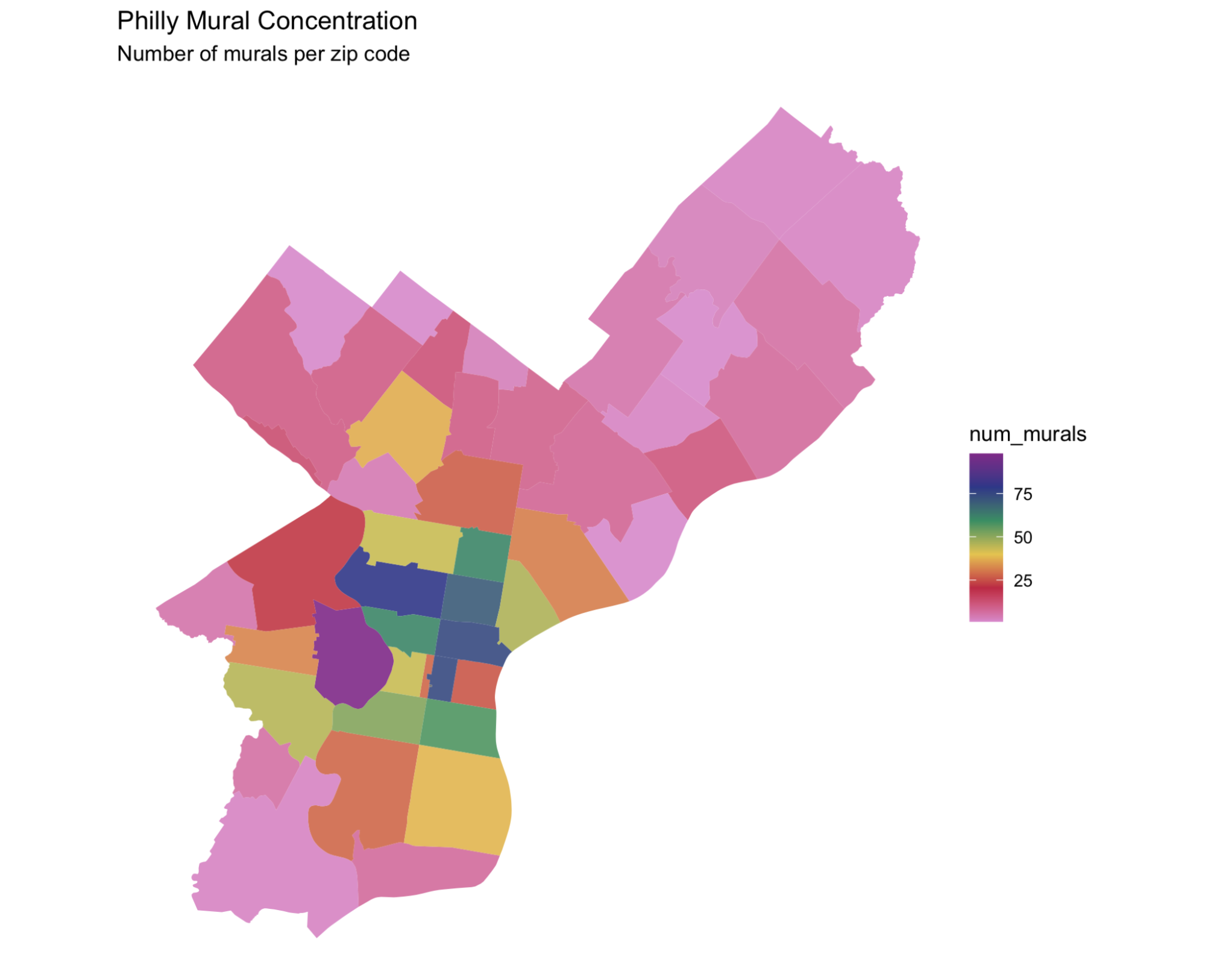
Mural density by Philadelphia zip code (Leaflet/Shiny)
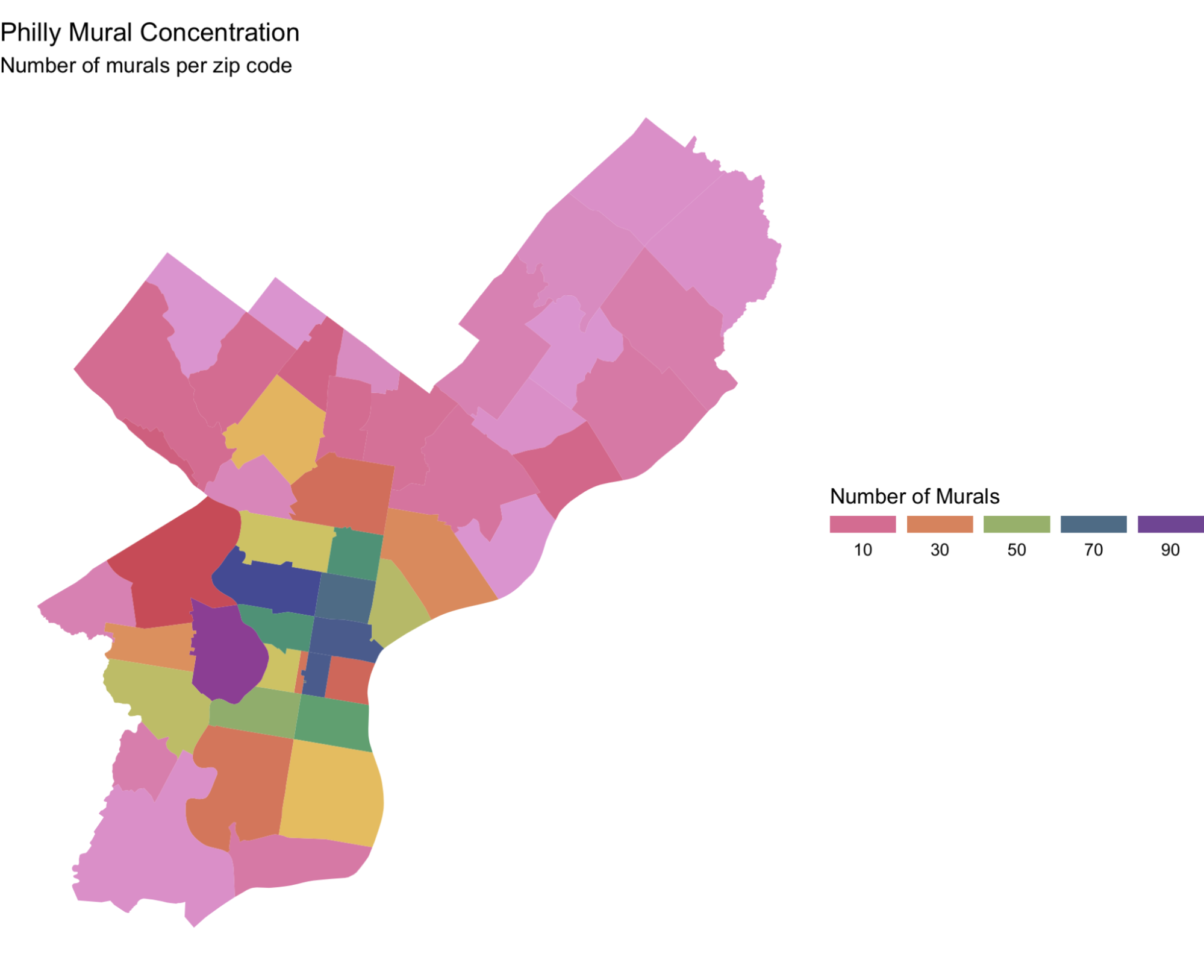
Mural concentration by zip code (static choropleth)
The mapping revealed that murals are concentrated in certain zip codes, with notable clusters in North and West Philadelphia.
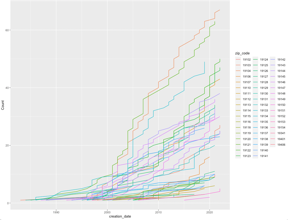
Cumulative mural count over time by zip code
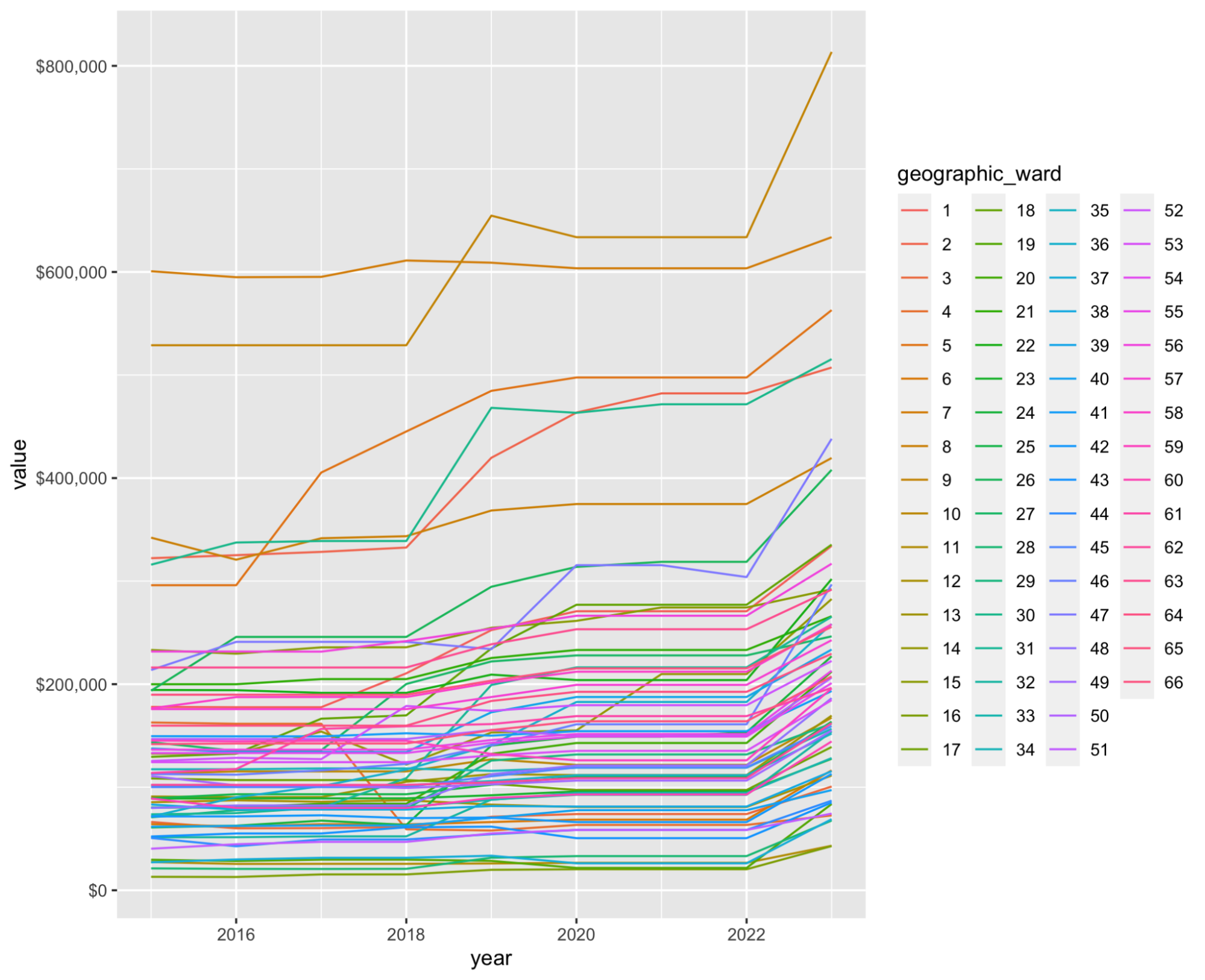
Average assessed property value by geographic ward, 2015--2023
What We Learned
- Property assessment data from city open data portals can be too short-term or too granular for neighborhood-level trend analysis. The ZHVI turned out to be a better fit.
- Spatial data wrangling in R (using
sf,terra, andleaflet) has a steep learning curve but produces compelling interactive visualizations. - Messy date fields are a recurring challenge in cultural datasets – building regex parsing pipelines early saves time.
Source Code and Data
All code and data from this project are available for download:
- Shiny app source code (R)
- Combined housing and mural dataset (CSV)
- Pelle Tracey’s full research notes (HTML) | RMarkdown source
- Shiny app development notes (Rmd)
Additional data files are in the leading-fellows data directory.
This project was part of the 2022 LEADING Fellowship, a data science program for LIS professionals run by the Metadata Research Center at Drexel University. Thanks to Felipe Valdez (Temple Libraries GIS) for guidance on spatial data sources, and to Eiman Ahmed for contributions to the data cleaning pipeline.